5.Royal Albert Hall
The famous London venue had a brand overhaul at the beginning of the year, in an attempt to appeal to a much wider audience.
The new logo makes use of the distinctive silhouette of the great hall, which was designed for use across a variety of media. The colour palette for the new icon harks back to its Victorian heritage with the use of vibrant reds and golds.
4. Hillary Clinton
Unsurprisingly, in 2015 the former first lady of the United States officially announced she running for President. Perhaps a little more surprising, though, was that Mrs Clinton set social media ablaze with the big reveal of her new brand identity.
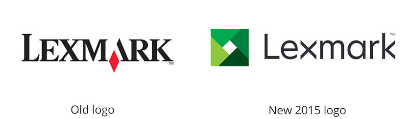
3. Lexmark
In 2015 the global laser printers manufacturer launched its new brand identity. The new logo was a distinct departure from its former, familiar red diamond logo.
The new identity captures the company’s continuing evolution, and aims to reflect its expanding openings and possibilities in the form of the shutter emblem.
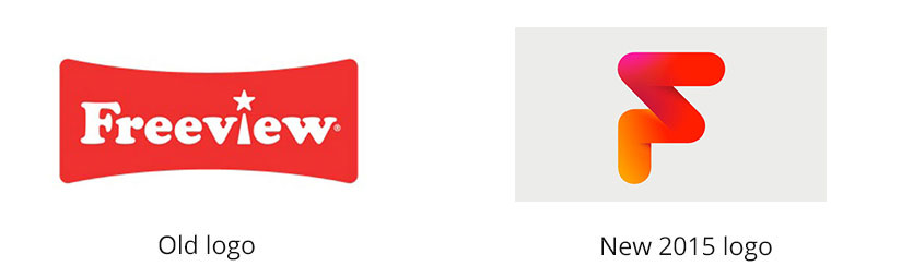
2. Freeview
In 2015 the UK’s most watched TV service unveiled a new logo. The new logo is a huge move away from its predecessor. Its angular form aims to suggest the company’s agility, choice and sense of form, whilst retaining the brand’s red heritage.
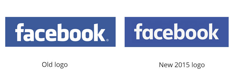
1. Facebook
Although probably not an obvious change, in 2015 Facebook made a couple of tweaks to its famous logo. The new logo marked the first time the company had changed its typeface since it launched as “The Facebook” way back in 2004.