
We were delighted to be selected by Visor Clear to develop the brand for their ground-breaking new product. Visor Clear has a remarkable prototype for a product that could make motorcyclists much safer when riding in bad weather.
Founder Mike Roberts noticed the perils motorcyclists face during wet weather, due to steaming up and leaving rain and road spray on their helmets. Without the window screen wipers which cars rely on, motorcyclists quickly have their vision obscured by bad weather, which can be very dangerous, particularly when driving at high speed or maneuvering through traffic.
To tackle this problem Visor Clear’s new product easily attaches to the thumb and works as a portable, simple but effective, manual helmet visor wipe.
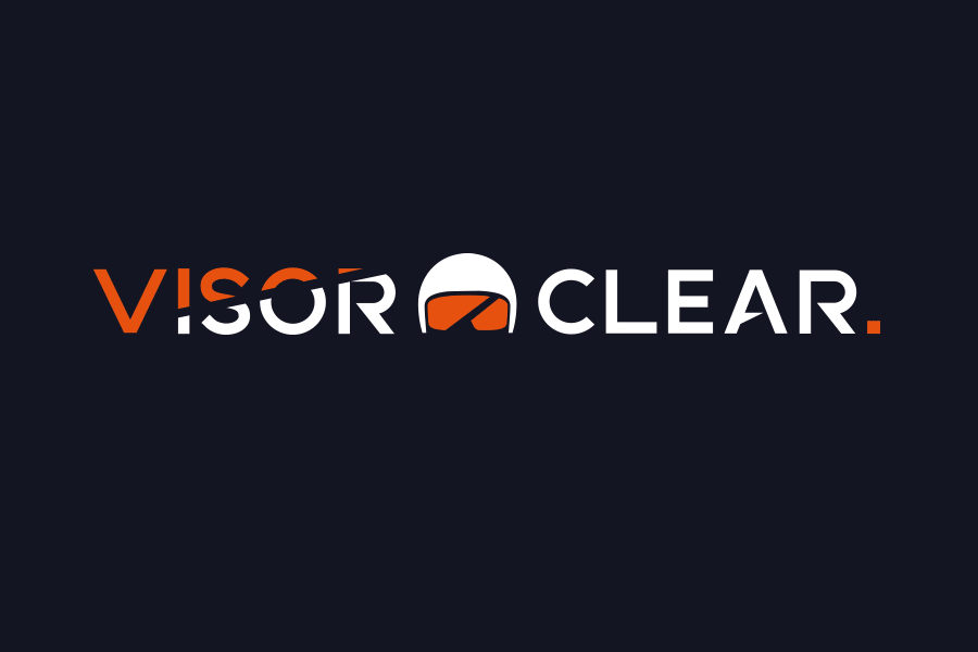
Visor Clear was keen to have a brand that was attractive, bold, simple and to the point, just like their product and we were more than happy to oblige.
What makes a successful brand logo is the ability to make it beautiful, eye catching, memorable and above all, match its visual aesthetic to the heart of the business or product it represents.
Our designers chose bold, clear and concise colours and crafted a strong and easily recognisable icon for the Visor Clear, which we feel clearly echo its connections to motorcyclists and remind users exactly what the product will deliver.
Motorcycling is a mode of transport but also a sport with some very dedicated fans so the logo needed to convey this strong, sharp atmosphere. Visor Clear has been very pleased with what we have delivered and our designers loved working on this project. We can’t wait to see the finished Visor Clear product when it hits the shelves soon.
If you have a branding project you would like our help with please get in touch.