World Cup fever is well and truly gripping the Country, but the 2014 logo has raised a couple of questions, not least why are there hands on the logo? After all you can’t use them when you play the game (…apart from throw-ins), but hands are apparently OK for the official emblem of the 2014 World Cup!
FIFA says on its website: “The role of the Official Emblem is to provide a strong, visual representation of both the event and the host country.”
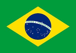
The emblem was apparently inspired by an iconic photograph of three hands triumphantly holding the World Cup trophy. The hands symbolize “warmly welcoming the world to Brazilian shores” according to FIFA, and the green and yellow represents Brazil’s rainforest and sun – as well as the country’s flag.
Our thoughts on the logo
Although we like the idea behind the logo, we feel that a number of factors let the famous emblem down:
One factor being the hands – they don’t look natural and they remind us of webbed frog’s feet, surely a proportioned goal keeper’s hand or gloves would have been more appropriate?
We also think the logo needs an additional colour to distinguish the three separate hands… perhaps blue to tie in with the Brazilian flag (below).
Finally we feel that the red ‘2014’ in the logo is needless in the emblem and would make more sense to have the date with the FIFA World Cup type.