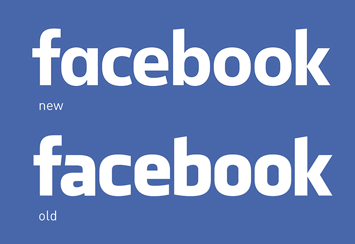
If you haven’t noticed the changes, you’re probably not alone. The social networking channel has unveiled a new logo, but the changes are rather subtle.

The concept of a blue background with ‘Facebook’ in white overlaid, remains the same, however, the font is new.
The slimmer, more streamlined font is still used in lower-case, however, the ‘a’ is perhaps the most noticeable difference.
Facebook’s Creative Director, Josh Higgins, said the objective for the new logo was to make the network appear more ‘friendly and approachable’.
The original logo was designed in 2005 by Joe Kral and Cuban Council, using Process Type Foundry’s Klavika as a starting point. Since then the ‘facebook logo’ has become instantly recognisable around the world. What makes this even more of an impressive achievement in itself is that the wordmark is very rarely seen on the Facebook site itself (go on have a look…we know you want to).


